Logo Usage


Is the shield white?

The flaming W should be the lightest
part of the logo. It should be white
when possible.


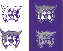
Is his tongue purple?
The tongue & teeth should be
the lightest part of the logo.

Is the font different?
The logo text should not be altered.


Is the department above WSU?
The department should always be under
Weber State University


Is the shield the color
of the background?
The shield should be purple when used
on a photo or colored background. There are some exceptions, including one-color printed promotional items.


Are there elements
close to the logo?
Maintain a free area equal to one half the height of shield around the mark to preserve legibility.


Has the 'W' been
removed from the shield?
Keep the 'W' in the shield,
paired with the wordmark
whenever possible.


Is there more than one
logo on a page?
Only use one WSU logo per page


Is the logo too small?
The primary signature should be at least 2.25" wide in print or 300 pixels wide on the web. The stacked logo should be at least .75" wide in print or 125 pixels wide for the web. In cases where your print area is too small to adhere to the minimum sizes, you can use the shield by itself.

We discourage using the shield by itself unless there are no other options.


Key
1. Flaming W Logo
2. Wordmark (one line & two line options)
3. Primary University Signature (1+2)
4. Primary Signature with Tagline
5. Tagline


Key
6. Secondary Signature
7. Academic Program Signature
8. Secondary Identity


Key
6. Secondary Signature
7. Academic Program Signature
8. Secondary Identity